

Pick your format by where the bar sells: wrappers and printed sleeves for retail shelves and D2C, folding cartons for mid-premium gifting, and rigid magnetic boxes for luxury or collectible drops. The reason is simple. Format has to match price point, unboxing expectations, and how “collectible” the line wants to feel, and getting that match wrong wastes money either way. Below, you’ll find categorized concepts, the materials that actually shift perceived value, and the production math that turns a Pinterest board into a real production run.
TL;DR:
- Wrappers and sleeves are ideal for mass-market chocolates due to their low cost, quick production, and shelf visibility features like windowed designs.
- Premium and luxury lines justify higher costs with finishes like deep embossing, foil stamping, and monochrome palettes that signal quality through tactile and visual cues.
- Sustainable options such as mono-material pouches and kraft board are suitable for short shelf-life products, but barriers needed for protection can complicate recyclability.
- Prototype small digital-print runs before full-scale production to identify design or material issues and optimize tooling efficiency across multiple SKUs.
- Design decisions should start with a clear primary channel, target price, desired finishes, sustainability priorities, minimum order quantity, and timeline to streamline the briefing process.
Table of Contents
- Chocolate Packaging Ideas Organized By Purpose And Look
- Materials And Finishes That Signal Premium Vs. Mass-Market
- Sustainable Packaging That Doesn’t Sacrifice Shelf Appeal
- Storytelling And Visual Language That Make Packaging Memorable
- Production Costs And Timelines For Small Chocolate Brands
- Real Design Projects Worth Studying Before You Brief A Supplier
- How I Think About A Chocolate Packaging Brief
- Turning A Packaging Idea Into A Finished Product With Space-Man
- Sources
Chocolate Packaging Ideas Organized By Purpose And Look
Not every idea fits every product, so it helps to sort by what you’re actually trying to sell. Here’s a working gallery, grouped by the job the packaging needs to do.
Mass-market and impulse buys live or die on shelf speed. These formats keep costs low and printing fast:
- Foil or paper wrappers with a single bold color and one strong mark, the classic candy-bar move
- Printed sleeves over a simple tray, which let you run short-order variations without new tooling
- Windowed sleeves that show the chocolate itself, which works well when the bar or bark looks as good as it tastes
Gifting and mid-premium lines need a slower reveal. A folding carton with a foam or card insert gives the chocolate somewhere to sit rather than rattle around, and a tray-and-slip design (the outer sleeve slides off to reveal a tray underneath) adds a small ceremony to opening the box. A ribbon or paper band around a simple carton, done well, can push a $6 box into $12 territory without touching the actual manufacturing cost of the chocolate.
Luxury and collectible releases are where you spend on finishing rather than volume. Rigid magnetic-closure boxes, deep embossing, and monochrome palettes with a hit of spot foil read as museum-shelf quality rather than grocery-aisle. According to Confetti’s packaging guide, the channel dictates the format: wrappers and sleeves suit mass retail and D2C bars, folding cartons suit mid-premium gifting, and rigid magnetic boxes belong to luxury gifting.
Kids’ and playful lines can get away with more noise. Die-cut shaped boxes, resealable pouches for sharing bags, and illustrated characters in bright spot colors do the heavy lifting here. Nobody expects restraint from a product aimed at eight-year-olds, and trying for it usually just looks confused.
Seasonal and limited editions thrive on structure plus variation. Keep the box shape identical across a series, then swap the artwork, an artist collaboration, a holiday palette, a numbered edition and you’ve built a reason for people to buy more than one.
Sustainable and minimal lines lean on kraft window boxes, mono-material pouches, and compostable inner liners paired with low-waste inserts. More on the trade-offs of that route below.
Materials And Finishes That Signal Premium Vs. Mass-Market
The substrate you choose says more than most copywriting ever will. Kraft board reads rustic and approachable. Coated matte board reads clean and modern. Laminated paper adds durability for anything that travels. Metalized paper adds shine and shelf pop, but it’s harder to recycle. Compostable films solve an end-of-life problem but often need a barrier layer added back in, which can undercut the “simple and green” story you’re trying to tell.
Finishing is where the tactile experience happens:
- Embossing and debossing create texture you feel before you see, a strong cue for craft or handmade positioning
- Foil stamping adds a metallic accent for logos or borders without covering the whole surface
- Soft-touch lamination gives a velvety, almost suede feel that reads expensive at a relatively low cost
- Spot UV adds selective gloss over a matte background, useful for making a logo or icon pop without a full foil budget
Color choices matter just as much as material. A restrained, tonal palette (soft greens, chalky lilacs, warm ambers) tends to read as more premium than literal flavor colors like bright orange for “orange chocolate.” Confetti’s guide points to tonal palettes as a differentiator specifically because they avoid the grocery-aisle habit of coding flavor with obvious color.
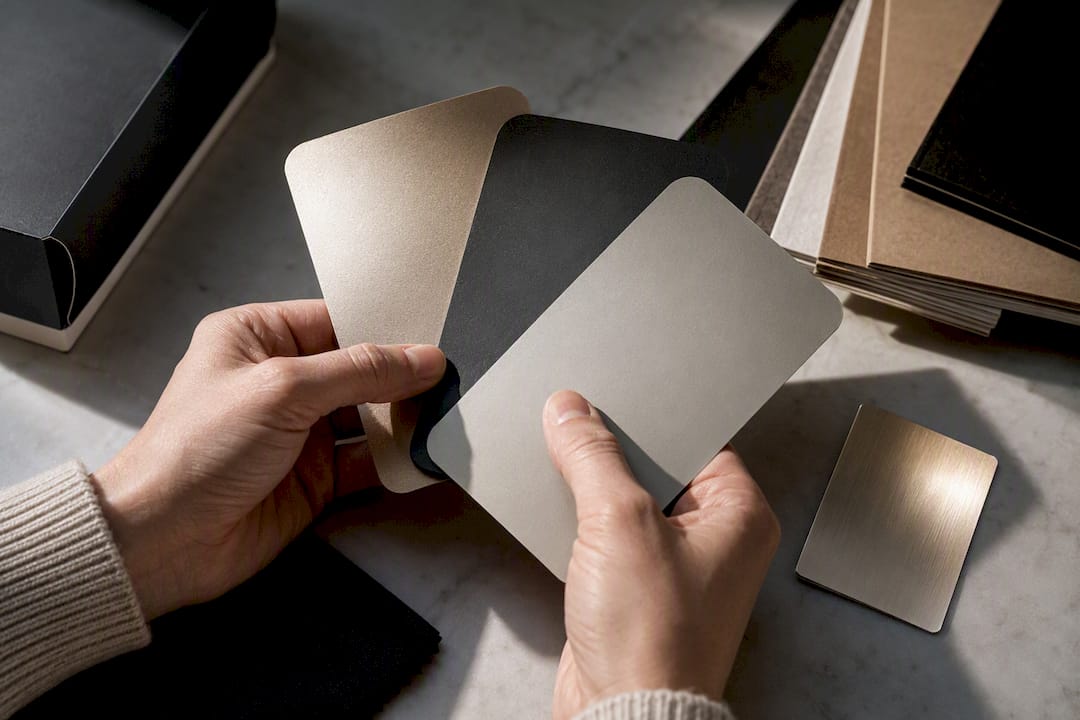
Pro Tip: Before committing to a finish, ask your supplier for a physical swatch card, not a digital mockup. Soft-touch lamination and matte coating look nearly identical on a screen but feel completely different in a customer’s hand.
Sustainable Packaging That Doesn’t Sacrifice Shelf Appeal
Recycled board and kraft paper work well when the chocolate doesn’t need a strong moisture or oxygen barrier, think short shelf-life bars sold locally, not products shipped across a country in summer heat. Once you need real protection against humidity or heat, you’re often looking at an added barrier film, and that’s where the sustainability story gets complicated.
Mono-material construction (a pouch made entirely of one recyclable plastic, rather than layered plastics bonded together) tends to be more genuinely recyclable than a “compostable” claim that only holds up in an industrial composting facility most towns don’t have. According to Confetti, the right pick usually comes down to shelf life and storage conditions. A hybrid, mono-material pouch with a recyclable board outer, is often the realistic middle ground.
A few low-cost ways to cut packaging waste without redesigning everything:
- Trim inserts to the minimum needed to stop breakage in transit, not decorative padding
- Consider refillable outer tins or boxes for repeat-purchase products
- Use a collectible outer sleeve instead of a full secondary box, so customers keep the sleeve and recycle less material overall
Be careful with wording on the label. “Biodegradable” and “compostable” are not interchangeable, and using either term loosely can create real labeling problems down the line.
Storytelling And Visual Language That Make Packaging Memorable
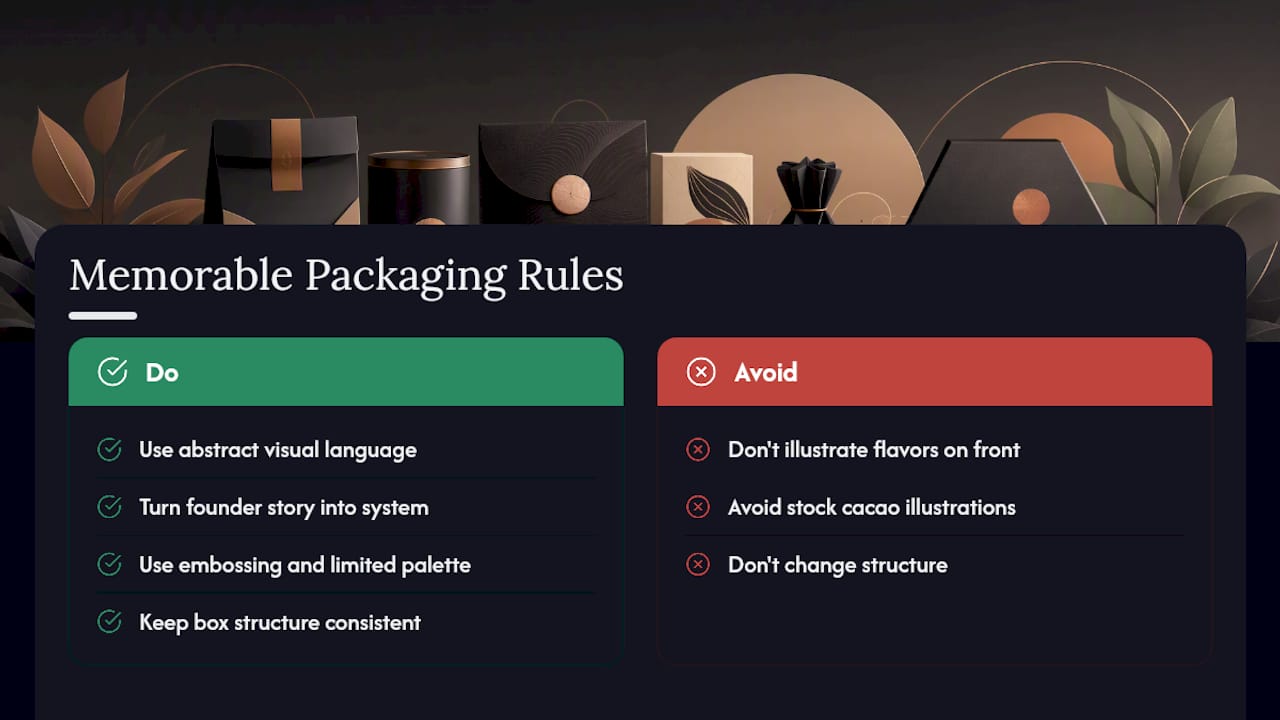
The chocolate brands that stick in people’s minds usually aren’t the ones explaining every flavor note on the front panel. Some of the sharpest work in the category comes from designers who skip literal flavor depiction entirely. Otherway’s packaging for Fortnum & Mason used expressive, abstract visual language and even sound to suggest a taste experience rather than illustrate it, trusting the customer to fill in the gap. That restraint invites a second look instead of a single glance.
A founder’s story or a piece of provenance research can become a repeatable visual system instead of a paragraph of back-of-box copy. A specific object, a color, a shape pulled from that story can show up across every SKU, which is a lot more ownable than a stock illustration of a cacao pod. The Clemens chocolate rebrand is a good example: deep research into a founder’s family migration story produced a visual direction that no mood board would have generated on its own.
Craft translation works the same way. SEV/Studio’s Ukiyo-e-inspired packaging used deep embossing that echoes woodblock carving, paired with a monochrome palette, to signal quality through method rather than through a printed image of the reference material.
If you want customers collecting your line rather than buying one bar and moving on, keep the structure of the box consistent across a series and vary the art, embossing pattern, or color instead. That combination, one fixed system with rotating detail, is what makes each new release feel like part of a set worth completing rather than a random new flavor.
Production Costs And Timelines For Small Chocolate Brands
Cost scales with four things: substrate choice, finishing complexity, tooling, and die lines. A basic printed wrapper needs no custom tooling at all. A rigid box with a custom die line and foil stamping needs upfront tooling costs that only make sense once your minimum order quantity clears a certain volume.
Here’s how the main formats stack up from a production standpoint:
- Wrappers and printed sleeves run cheapest and fastest, with short lead times and low minimums, which makes them the default for anyone testing a new flavor or launching D2C.
- Folding cartons sit in the middle. Tooling costs more than a sleeve but less than rigid box tooling, and they scale reasonably well from small runs into retail volume.
- Rigid boxes cost the most per unit and need the longest lead time because of the tooling involved, but they carry the highest perceived value per unit, which is why luxury and collectible lines lean on them.
Confetti’s channel guidance ties these format choices directly to supply chain and cost realities, not just aesthetics, worth keeping in mind before you fall in love with a rigid box you can’t yet afford to tool.
Pro Tip: Prototype in small digital-print runs before committing to offset printing or custom tooling. A hundred sample cartons cost a fraction of a full production run and let you catch color or structural problems before they’re baked into thousands of units. Modular designs that reuse the same die line across different graphics also stretch your tooling investment across multiple SKUs instead of paying for a new die every time.
Real Design Projects Worth Studying Before You Brief A Supplier
A few real projects show what these ideas look like once they leave the mood board. Otherway’s work for Fortnum & Mason leaned on tonal palettes and suggestion instead of literal flavor callouts, letting the packaging hint at an experience rather than describe it. SEV/Studio’s Ukiyo-e project used embossing as a craft translation, a physical texture that references woodblock printing, combined with monochrome restraint to build a collectible feel. And the Clemens rebrand shows what happens when a designer does the research first: a family migration story became the source of every visual choice on the box, not an afterthought bolted on after the design was already done.
The common thread across all three: none of them started with “what does chocolate packaging usually look like.” They started with a story or a craft process, then let the format follow.
Before you brief a supplier or a design partner, get clear on six things: your primary channel, your price target, the finishes you actually want (versus just admire), how much sustainability matters to your customer, your realistic minimum order quantity, and your timeline. Nail those six and the design conversation gets a lot shorter.
How I Think About A Chocolate Packaging Brief
Working inside candy manufacturing day to day changes how you look at a pretty box. It’s easy to fall for a finish that looks stunning in a render and turns into a nightmare on a filling line. My approach starts with the same six questions from the checklist above, because packaging that can’t survive production or shipping isn’t really packaging, it’s a sketch. Chase the story and the finish you want, but pressure-test it against your actual channel and budget before you fall in love with it.
— Chadi
Turning A Packaging Idea Into A Finished Product With Space-Man
Space-man is the shortcut between a Pinterest board full of chocolate packaging ideas and a pallet of finished, sellable product. As a Canadian freeze-dried candy manufacturer that also runs private-label, co-packing, and bagging services for other consumer goods brands, we work with founders who have a design direction but no factory floor to test it on.
A typical starter engagement includes a design review against your chosen format (wrapper, carton, or rigid box), a prototype recommendation based on what your budget and MOQ can actually support, and honest feedback before you commit to tooling you can’t undo. We’ve walked brands through the exact wrapper-versus-carton-versus-rigid-box decision covered above, and matched it to real production numbers instead of guesses. If your next step is figuring out what a private-label or co-packing run would actually cost and look like for your product, our private label and co-packing services page is where to start that conversation.
Sources
- Packaging design: chocolate guide — Confetti
- Designing taste through sound — Otherway’s chocolate packaging for Fortnum & Mason — The Dieline
- Ukiyo-e packaging design — DesignRush
- Clemens chocolate rebrand — Creative Boom