

What’s trending in creative chocolate packaging right now?
The best chocolate packaging in 2026 does one thing before anything else: it makes someone stop. Not because it screams loudest, but because it says something specific. Whether that’s a kraft box with copper foil stamping, a wrapper that unfolds like a gallery exhibition, or a magnetic keepsake box that clicks shut with that satisfying thud, the packaging ideas earning real attention this year share a common thread. They treat the box as part of the product, not an afterthought.
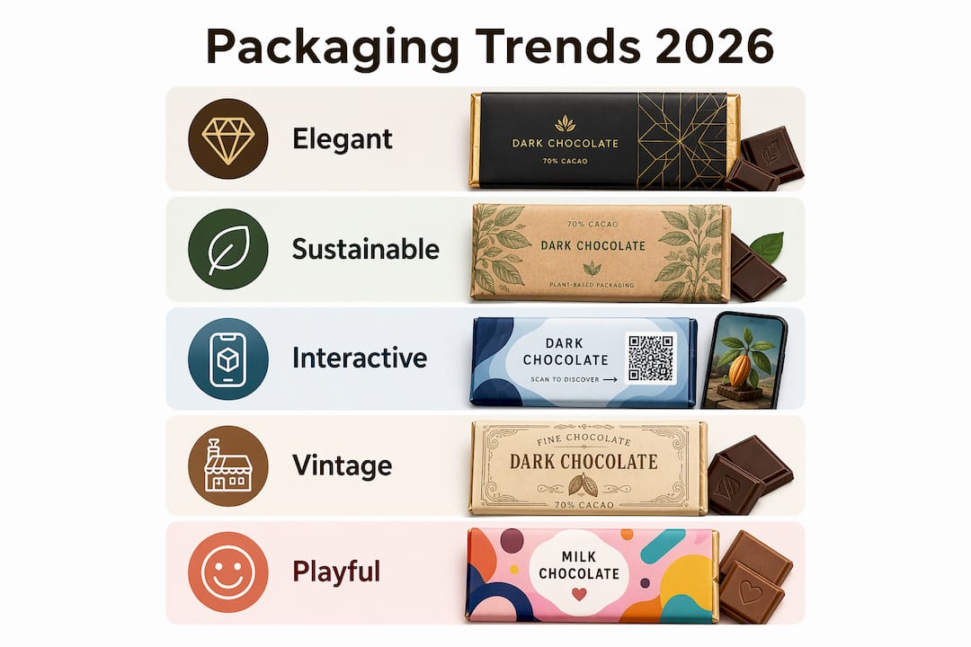
Here’s a quick snapshot of the styles and directions shaping the market right now:
- Eco-Luxe: Sustainable materials paired with premium finishes like foil stamping or letterpress
- Luxury rigid boxes: Magnetic closures, embossing, velvet inserts, and jewel-tone palettes
- Interactive packaging: QR codes, augmented reality (AR) experiences, and scannable content
- Vintage and limited-edition: Hand-drawn illustration, classic typography, collectible appeal
- Occasion-driven gifting: Packaging built around specific moments, from birthdays to thank-yous
- Playful and colorful: Bright palettes, whimsical characters, and easy-open formats for younger buyers
- Artistic storytelling: Illustration-wrapped bars that function as collectible art objects
Understanding how packaging influences sales is the first step before choosing a direction. The sections below break each style down in detail.
1. Elegant and luxurious chocolate packaging designs that stand out
Luxury packaging earns its price tag through restraint, not excess. The most effective high-end chocolate boxes use one or two premium details executed perfectly: a matte black exterior with a single gold foil logo, or a deep burgundy rigid box with debossed lettering and a velvet insert tray. That’s it. Every additional element dilutes the effect.
The design elements that consistently signal premium quality include:
- Texture: Soft-touch lamination, linen-effect paper, or embossed patterns that beg to be touched
- Foil stamping: Gold, silver, rose gold, or copper accents on logos and borders
- Typography: Serif letterforms with quiet authority, neither nostalgic nor starkly modern
- Color palettes: Deep browns, jewel tones (emerald, sapphire, burgundy), and metallic accents
- Magnetic keepsake boxes: Rigid construction with a satisfying magnetic closure that customers keep long after the chocolate is gone
- Layered unboxing: Tissue paper, tasting note cards, and custom insert trays that slow the reveal
Magnetic closure boxes represent the gold standard for gifting contexts, from weddings to corporate orders. The rigid board protects chocolates during shipping, and the tactile experience of opening one genuinely changes how the product feels before anyone takes a bite.
Pro Tip: Add embossing or debossing to your logo on a rigid box. Fingers naturally trace raised or pressed textures, and that touch creates a memory associated with your brand.
Personalization layers on top of this beautifully. Custom names, monogrammed covers, and handwritten note inserts transform a luxury box into something that feels chosen rather than grabbed off a shelf. For brands exploring luxury chocolate branding paired with sustainable materials, the two goals are more compatible than they look.
2. Sustainable and eco-friendly chocolate packaging innovations and their impact
Eco-friendly packaging is no longer a niche preference. Consumers actively look for recyclable and sustainable options, and brands that ignore this are losing shelf credibility fast. The good news is that sustainable materials have caught up aesthetically. You don’t have to choose between looking premium and being responsible.
Paper-based packaging can reduce packaging weight by up to 61% compared to traditional cardboard and foil structures for a 200-gram chocolate bar. That’s a meaningful reduction in material use, shipping weight, and end-of-life waste, without sacrificing barrier performance when the paper is properly specified.
The leading materials and approaches in 2026 include:
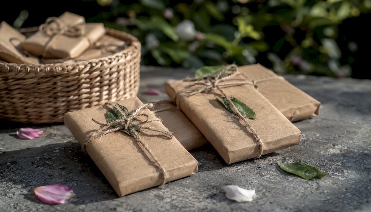
- Recycled kraft board with soy-based inks and paper ribbon closures
- FSC-certified and EU Ecolabel cardboard made from wood waste, unbleached, and fully recyclable
- Compostable bonbon wraps replacing traditional foil-aluminum structures
- Molded pulp inserts as an alternative to plastic or foam trays
- Metallized paper that is recyclable, approved for direct food contact, and offers the glossy look brands want
The Eco-Luxe approach is the most commercially effective version of this: raw kraft texture combined with one rich accent, like copper foil stamping or a deep brown letterpress logo. It tells two stories simultaneously. “We care about the planet” and “we make something worth paying for.” That combination builds brand loyalty in a way that neither story alone can.
One technical caveat worth knowing: switching from foil-aluminum wrappers to mono-material paper requires vetting barrier properties carefully. Paper that lacks adequate moisture and grease resistance can cause bloom or staleness. Bench testing before committing to a full run is not optional.
3. Interactive, engaging, and experiential chocolate packaging concepts
The most memorable packaging doesn’t just hold chocolate. It gives the buyer something to do. QR codes, AR animations, and sensory design elements turn a static box into an experience, and that experience is what gets photographed, shared, and remembered.
Practical interactive elements worth considering:
- QR codes linking to a thank-you video, a chocolate pairing guide, a curated playlist, or an AR animation
- Seasonal content swaps: Same physical box, new linked experience each quarter. Low cost, high freshness.
- Occasion-driven naming: Products built around specific moments, like “Thank You,” “Sip! Sip! Hooray,” or “Happy Birthday,” where the packaging communicates the gift’s purpose before the buyer reads a word of copy
- Sensory design: Typography that suggests rhythm and pacing, color palettes that express mood rather than literal flavor, and illustration that rewards close looking
Maeve Celebrations is a strong example of occasion-driven packaging done right. Each bar in the collection pairs a specific social moment with a flavor concept that supports it. Cookie crumble becomes gratitude. Popping candy becomes a toast. The packaging links occasion to flavor so precisely that buyers can choose by feeling rather than just by taste, which broadens the purchase occasions considerably.
Pro Tip: When adding a QR code, change the linked content seasonally. The box stays the same; the experience refreshes. It’s one of the highest-return updates you can make for almost no additional print cost.
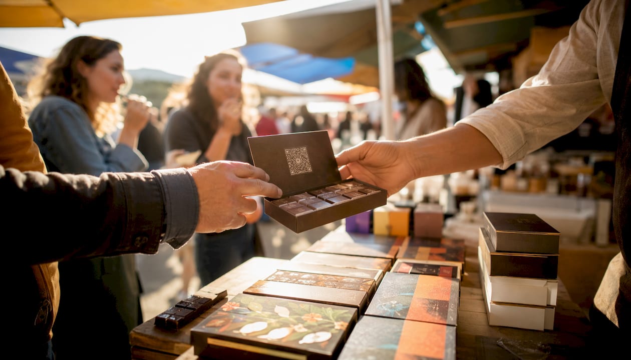
Sensory packaging design treats the package as a brand manifesto, using visual grammar to invite exploration rather than explain the product literally. That’s the difference between packaging that gets discarded and packaging that gets kept.
4. Vintage-inspired and limited-edition chocolate packaging designs
Nostalgia sells, but only when it’s executed with enough craft to feel intentional rather than retro-for-retro’s-sake. The vintage packaging styles gaining traction in 2026 borrow from early twentieth-century editorial art, European concert posters, and hand-lettered confectionery traditions, then filter them through a contemporary lens.
Key elements of effective vintage-inspired packaging:
- Hand-drawn illustration: Gestural, line-drawn figures that feel human and imperfect, not digitally sterile
- Classic typography: Serif letterforms, condensed display fonts, and decorative borders from pre-digital print traditions
- Warm, muted palettes: Cream, ochre, forest green, dusty rose, and aged gold rather than saturated modern colors
- Storytelling details: Maps of origin regions, portraits of founders or farmers, or illustrations of the production process
- Limited-edition framing: Numbered runs, seasonal releases, or artist collaborations that create genuine scarcity
Limited editions do something regular packaging can’t: they give buyers a reason to act now. A seasonal tin or a numbered artist collaboration turns a chocolate purchase into a small collecting decision. Brands that release limited runs consistently build a customer base that returns specifically for the next drop.
The Chocolate Gallery project in Williamsburg, New York, takes this to its logical extreme. Artists create bespoke illustrations that wrap each bar, and as the wrapper unfolds, hidden details and symbolic references reveal themselves before the chocolate appears. The packaging functions as a collectible artwork, and the chocolate is the final reveal. That’s a genuinely different value proposition from anything a standard retail bar can offer.
5. Simple, unique, and colorful packaging ideas ideal for children and playful markets
Not every chocolate needs to whisper luxury. For kids’ lines, impulse buys, and casual gifting, the goal is immediate joy. Bright, bold, and a little bit silly is exactly right.
What works for playful packaging:
- Saturated primary colors and unexpected combinations (electric yellow with cobalt, hot pink with lime green)
- Whimsical characters: Mascots, illustrated animals, or abstract figures with personality and movement
- Easy-open formats: Tear strips, flip-top lids, and peel-back wrappers that kids can manage without help
- Playful typography: Rounded letterforms, hand-lettered styles, and type that bounces or tilts
- Interactive elements: Puzzles printed on the inside of the box, stickers included with the bar, or collectible character series
Atelier C’s packaging concept is a useful reference point here, even for a premium brand. Designer Yuliia Hrabynska built the identity around a melting chocolate character with expressive legs mid-walk. The palette is punchy pink, deep black, and bright orange. The result is packaging that feels bold and fun without losing its premium edge. The lesson for playful markets: a strong character with a clear personality does more work than a dozen decorative elements competing for attention.
Simplicity drives impulse purchase in this segment. A shopper grabbing something for a kid’s birthday doesn’t want to decode the packaging. They want to understand it in two seconds and feel good about the choice. Clear occasion, clear character, clear color. That’s the formula.
6. What the data and experts say about packaging that actually sells
Packaging decisions that feel aesthetic are actually commercial decisions. A majority of consumers prioritize packaging design as an important buying factor for chocolate products. The box is the first product experience, and it sets the price expectation before anyone reads the ingredient list.
| Packaging Element | Consumer Impact | Best Application |
|---|---|---|
| Foil stamping or embossing | Signals premium quality | Luxury gifting, corporate orders |
| Eco-friendly materials | Builds brand trust | Conscious buyers, farmers markets |
| Occasion-specific naming | Reduces purchase hesitation | Everyday gifting, seasonal lines |
| QR code or AR experience | Increases shareability | Online sellers, younger audiences |
| Hand-drawn illustration | Creates uniqueness and brand recall | Artisan and bean-to-bar brands |
| Magnetic closure | Elevates unboxing experience | High-end retail, wedding favors |
Tom Moore, Design Director of Otherway, described the challenge of their Fortnum & Mason packaging project this way:
That philosophy applies well beyond one prestige project. Visual grammar in packaging avoids clutter by focusing on typography, palette, and layered narrative rather than explicit flavor descriptions. The packaging that invites exploration outperforms the packaging that explains everything.
Testing packaging materials for cost, protection, and aesthetic fit is especially critical for smaller brands. A prototype run before committing to a full production order catches problems with barrier performance, structural integrity, and print quality before they become expensive mistakes. For gourmet packaging decisions in the freeze-dried candy and confectionery space, this testing step is where most budget overruns actually originate.
7. What materials are driving chocolate packaging forward in 2026?
The material conversation in chocolate packaging has shifted from “what’s recyclable?” to “what’s recyclable and performs as well as what we’re replacing?” That’s a harder question, and the industry is actively working through it.
Mono-material paper structures are the most discussed development. Traditional chocolate bars use two separate wrapping elements: aluminum foil in direct contact with the chocolate, and a decorative paper sleeve over it. Moving to a single paper-based wrapper simplifies recycling, reduces production steps, and cuts material weight. The barrier challenge is real, though. Paper that lacks adequate moisture and grease resistance causes bloom, the grayish fat bloom that makes chocolate look old and unappetizing. Brands switching to paper need to specify the right barrier coatings and run bench tests before scaling.
Metallized paper is emerging as a practical middle ground. It’s recyclable, approved for direct food contact, offers the glossy premium look that many brands and consumers still expect, and prints well. For brands that built their identity around a shiny, indulgent wrapper, metallized paper lets them move toward sustainability without abandoning the visual language their customers recognize.
Recycled paperboard, molded pulp inserts, and compostable films round out the current material toolkit. The vibrant food presentations that earn attention in gastronomy and specialty retail increasingly rely on these materials, precisely because they photograph well and communicate care without a single word of copy.
8. Functional packaging elements that protect and delight
A beautiful box that lets the chocolate melt, shift, or bloom is a failure. Function and aesthetics have to solve the same problem together.
Freshness preservation starts with barrier properties. The packaging material, whether foil, metallized paper, or a coated kraft board, must block moisture and oxygen effectively. For filled chocolates with ganache or caramel centers, this matters more than for solid bars. Humidity is the enemy, and packaging that breathes will shorten shelf life noticeably.
Ease of opening is underrated as a design consideration. Tear strips, perforated openings, and magnetic closures all serve different contexts. A magnetic keepsake box is perfect for gifting but impractical for a grab-and-go retail bar. A tear-strip wrapper is fast and intuitive but offers no resealing. Matching the opening mechanism to the actual use case, not just the aesthetic, is where functional design earns its keep.
Insert trays solve the shifting problem. Custom paper, molded pulp, or fabric-lined trays sized to the specific chocolates prevent movement during shipping, protect surface decorations, and make the unboxing feel intentional. A truffle that arrives with a scuff mark on its decoration undermines every dollar spent on the outer box.
Resealability is increasingly expected for multi-piece boxes. Zip-lock closures on flexible pouches, or boxes with a friction-fit lid that closes cleanly, let buyers enjoy part of the box and return to it without the chocolate drying out or absorbing refrigerator odors.
9. Regulatory considerations for chocolate packaging in the US market
Chocolate packaging sold in the United States must comply with Food and Drug Administration (FDA) requirements for food contact materials, labeling, and allergen disclosure. Getting this wrong is expensive, so it’s worth understanding the basics before finalizing any design.
Food contact compliance: Any material that touches the chocolate directly, including inner wrappers, insert trays, and tissue paper, must be FDA-approved for food contact. This applies to inks, coatings, adhesives, and the substrate itself. Soy-based inks are generally food-safe, but verify with your printer. Recycled paperboard requires specific vetting because recycled content can introduce contaminants.
Labeling requirements: The FDA requires a statement of identity, net quantity of contents, ingredient list, nutrition facts panel, and manufacturer or distributor name and address. For chocolate specifically, the standard of identity rules under 21 CFR Part 163 define what can legally be called “chocolate,” “milk chocolate,” “dark chocolate,” and so on. Using these terms incorrectly on packaging is a compliance violation.
Allergen disclosure: Milk, tree nuts, peanuts, soy, and wheat are common allergens in chocolate production. The Food Allergen Labeling and Consumer Protection Act (FALCPA) requires clear disclosure of major food allergens, either in the ingredient list or in a separate “Contains” statement.
Net weight: The Fair Packaging and Labeling Act (FPLA) requires net weight declarations in both metric and US customary units on the principal display panel.
Working with a co-packer or private label partner who already understands these requirements saves significant time. Space-man’s private label and co-packing services are built around exactly this kind of compliance-aware packaging work for confectionery brands.
Key Takeaways
Creative chocolate packaging in 2026 succeeds when it combines a clear aesthetic direction, the right functional materials, and packaging that earns its place as part of the product experience.
| Point | Details |
|---|---|
| Sustainability is now baseline | Paper-based packaging can reduce packaging weight by up to 61% compared to traditional cardboard and foil structures for a 200-gram chocolate bar, but barrier testing is essential. |
| Luxury and eco are compatible | Eco-Luxe packaging pairs kraft materials with premium finishes like copper foil stamping to satisfy both values at once. |
| Occasion-driven design sells | Linking packaging to specific moments reduces purchase hesitation and broadens the occasions where the product fits. |
| Visual grammar beats explanation | Restrained typography, cohesive color, and layered illustration outperform packaging that over-explains the product. |
| Compliance protects the brand | FDA food contact rules, FALCPA allergen disclosure, and FPLA net weight requirements apply to every US chocolate package. |